My Story: As a programmer, I have long admired design talent from afar, like a superpower that I missed out on in the genetic lottery. In truth, not being able to design well made me feel like half a developer. Whenever I had an idea for a new project, the backend code required would occur to me immediately, but the design decisions would drag me down into a spiral of wasted time and plummeting self-efficacy. Many of my personal side projects died in Photoshop.
One day, I got tired of wanting to be good at design while continuing to suck at it, and started hitting the books. Today, I’m still don’t consider myself a professional-grade designer, but I do feel significantly more handy and in control when I have to make design decisions (and I'm still learning!). Here are a few tips I learned along the way.
Tip #0 - Be realistic about your constraints
A great designer spends 40 hours a week designing things and solving design problems. You can’t do that, because you’re employed as a programmer. At best, you may get 1-5 hours per week to try designing something. You can’t catch up to full-time designers in the traditional way, so your goal should be to get 75% of the way there with hacks and strategic practice sessions, and then spend your 1-5 hours per week trying to close the remaining 25% gap.
What’s the gap? The gap is feel. There are objective rules-of-thumb in design, and there are techniques that depend on experienced, subjective intuition. Focus on learning the objective rules first, and then work on the “feel” skills. Learning the rules-of-thumb help you fake the “feel” skills you don’t have yet. And if you don’t know the basic rules, a moderate amount of feel won’t save your design.
Example:
- Objective rule-of-thumb: Don’t use more than 2 font families (one for headlines, one for body). When in doubt, stick a single, versatile font family that includes lots of weights and styles.
Subjective “feel” technique: Picking typefaces that feel right together.
Learn all the #1’s first, then worry about the #2’s.
Tip #1 - Learn how to use a baseline grid first

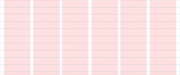
Most of the time, the difference between a sloppy-feeling design and a professional-feeling design is the presence of a baseline grid, which places consistent and mathematically-proportional spacing between all site elements (paragraphs, headings, ads, etc). Grids are easy to start using; and best of all, they’re objective.
Helpful and relevant links…
- Smashing Magazine: Technical Web Typography: Guidelines and Techniques. This my favorite baseline grid tutorial. It’s long, but it covers every important aspect perfectly.
- GridGuide Plugin for Photoshop (freeware). This plugin will save you loads of time. It creates baseline grids in with Photoshop guides, and it's totally free. Cool sub-feature: It uses a single Photoshop action, so if you create a grid you don't like, you can undo in one step and try again.
Tip #2 - Understand the power of typography, but don’t get hung-up on fonts

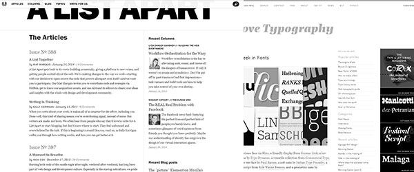
Could you design a website without using colors, borders, or graphics? If you had to design a site using only black text, a white background, and spacing, what kind of decisions would you make? What would you pay attention to? That is the challenge of good typography: conveying the message purely through the text, even before using color and other elements.
Try doing this once (designing a website using only text), and you’ll immediately understand how powerful type is. For better or for worse, type is the skeleton of every design. Don’t worry about getting it perfect; worry about not making it hideous. Focus text size, weight, and spacing (see baseline grid, above), and don’t waste too much time memorizing exotic font faces.
I spent close to $100 and way too many hours learning about about the anatomy of type and lettering: descenders, ascenders, loops and the subtle differences between a given two fonts. In retrospect, I wish I’d skipped most of that, and focused on practicing layout more, and on learning the names for types of fonts (e.g., script, slab serif, display). I’m not advanced enough yet to be like “I need a font with slender ascenders.” But I do occasionally see a billboard and think “Huh. That ad for Moe’s mexican food uses a slur serif font for the word ‘Sour Cream’ because it scoops and curves like a dollop of sour cream.”
Tip #3 - Learn the words, so you can sing the music

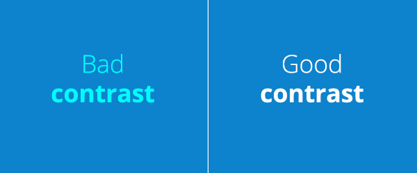
There are certain design terms (e.g., emphasis, contrast, balance) that are more frequently-occurring in a designer’s brain than you might realize. When you’re struggling to figure out what’s wrong with a design, knowing these terms (and how they’re applied) will help you put a name to the problem you’re having (making it easier to solve). You’ll be staring at a bland design, and thinking “It needs more...more...contrast!” And then a quiver of solutions will suggest itself to you.
Helpful and relevant link...
Treehouse Tutorial Course: Aesthetic Foundations. Treehouse has a great video course on these design concepts. Treehouse costs money, but the 14 day free trial they offer as of this writing should be enough time for you to get through the design course.
Tip #4 - Ignore color meanings (for now). Use pre-existing color schemes.

Don’t read a bunch of articles on color theory. Don’t try to memorize color meanings. That stuff will cloud your thinking. Color is extremely subjective. Particular color meanings can fall apart under different contexts, and the same color can have different meanings in different cultures.
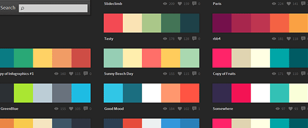
Picking the right colors is hard for our robotic programmer brains. Plan on spending a long time getting good at it. In the mean time, use Adobe Kuler and ColourLovers liberally to find color schemes that have already been put together by pro designers.
Finally, color meanings may be inconsistent and hard to apply for beginners, but color schemes follow objective rules that you can learn (monochrome, complementary, analogous, etc.).
Helpful and relevant link...
CodeSchool’s Fundamentals of Web Design course includes a video and test/game for helping you understand color scheme types. And uniquely, CodeSchool’s course includes a test/game element that trains you to use the different color schemes for actual site designs.
Tip #5 - Use inspiration liberally, but don’t copy verbatim

Real designers, when faced with a new project, don’t open Photoshop and immediately start painting web-brilliance from start to finish. They often stop to search for inspiration. They research the feel and the concepts they’re going for, and then they go back to working on specifics. Think of it like exhaling and inhaling.
Inspiration isn’t everything, and it isn’t the same thing as copying. Inspiration is a tool that helps un-stick you. The quickest way to overcome designer’s block (which you’re going to encounter a lot until you get better) is to try and think of other people who’ve had the same problem, and look at how they solved it. Either you’ll like something about their solution, or hate something, or both (each of those reactions is useful and prescriptive).
Try to avoid copying solutions without understanding why they work better. If you were designing a car, and couldn’t figure out how the taillights should look, would you rip the taillights off a Ferrari and call it a day? They’re Ferrari taillights, so of course they’re going to be better than any taillights you design, so you can’t lose, right? A copied element may look nice on its own, but it can destroy the cohesiveness of your design and come off as more anachronistic than cool.
Rather than copying the taillights, search your feelings to understand what you like about the Ferrari taillights, and then try to copy that aspect.
Tip #6 - Learn to think with your heart

When you need to test code, you can run it in a browser and check for errors. When it breaks, you usually know why. You get an error message, or at least a block of lines to start looking in. And most importantly, you know what working looks like. And when something’s missing, it's something definable and finite: Whups, forgot to select the database after connecting to it.
Design isn’t so straightforward. When there’s an error, you don’t immediately know what’s wrong. And when you want to improve it, you don’t immediately know what better or working looks like. So, like a good programmer, you try to logic-out the answer. You try to look for the missing semicolon. But no obvious, objective flaw jumps out at you.
Design is much more emotional than programming. If you want to communicate an emotion with your design, you have to feel that emotion when you’re creating the design. Many design problems are solved by thinking and feeling at the same time: by feeling what should be in a space, and then using your brain and experience to execute that feeling. This can be awkward at first, since you’re used to programming on pure thinking.
Tip #7 - When you get disheartened, try to put words to what your design lacks.
You take a million design tutorials. You follow every instruction to the letter. You play all the little design games around the web and take them way too seriously. You buy pencils and sketchpads, and try to get inspired. You mock up your design, perfect every pixel, align every ad and headline to a perfect grid. And it still looks like unprofessional, boring crap compared to the websites done by “real” designers.
It’s tempting during these moments to compare your design to a “real” designer’s work, and find your design lacking “because that other website was designed by someone with talent and artistic eyes that I will never have.” That kind of thinking doesn’t help you improve your skills. Whenever you find yourself comparing your design to another and fretting about it, try to define in precise words what the difference is between your design and the “real” design that you’re comparing it to.
Here are some descriptions you might arrive at, and some possible solutions...
- Their site has an unexpected, cutesy element (like the MailChimp chimp) that you could never illustrate yourself. But could you commission something cheaply on a site like eLance?
- Their site feels more comfortable and...physical. Why? Usually, there's a subtle texture involved. Maybe search for free textures?
- The content boxes on their site feel more finished. Take a screenshot, then zoom-in. Often, designs that feel more polished have subtle, one-pixel transitions between colors that are trivially easy to do in CSS, and really kick the feel of your design up a notch in professionalism.

